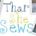
I'm no Web designer. Far from it. But I was sick of my banner, so I played around and came up with something new. I would really love the feedback, especially because my husband's immediate reaction was that the words are too small. Agree? Disagree?
Thanks!
Edited to add.... Oh, and yes, I made a new button, too. You can grab it if you like. Right over there on my side rail. :)

I ♥ it!!!! I don't think the words are too small, but I don't have Jimmy's professional eye ;o) I just like what I like!
ReplyDeleteI think it looks great, love the color scheme.
ReplyDeleteI love the colors and how it goes together well. I don't think the words are too small at all. If you change it, which I don't think you need to, I would suggest moving the photos on the right further to the right and maybe the words up a smidge. But I only noticed these things from concentrating on the the header since you asked!!!
ReplyDeletelove it and you're too cute!
ReplyDeleteLove it here too! Words look fine to me!
ReplyDeleteI think it looks great!
ReplyDeleteI think it looks great, and I don't think the words are too small! Very cute, and I will be grabbing your button!
ReplyDelete